
Fun With Random Numbers: More Random Projection
Last time we learned about a method of dimensionality reduction called random projection. We showed that using random projection, the number of dimensions required to preserve the distance between the points in a set is dependent only upon the number of points in the set and the maximum acceptable distortion set by the user. Surprisingly it does not depend on the original number of dimensions. The proof that random projections work is hard to understand, but the method is very simple to implement in just a few steps. To reduce the dimensionality of a set of m points in an N dimensional space:
- Get your data into a m × N matrix D
- Choose your maximum allowable percent distortion ε
- Calculate the number of dimensions for your reduced space, n = ln(m) / ε2.
- Sample the entries of an N × n matrix from the standard normal distribution, R.
- Multiply D by R.
Today we’re going to add a couple steps to this method and find another surprising result.
Let’s color the world
Let’s get some data. We’re going to work with the cities15000 dataset from geonames.org. Let’s download it, clean it up, and take a look…
if (!file.exists("~/cities15000.zip")) {
  download.file("http://download.geonames.org/export/dump/cities15000.zip", "~/cities15000.zip")
  unzip("~/cities15000.zip")
}

cities = readr::read_tsv("~/cities15000.txt",
                         col_names = FALSE,
                         col_types = "ccccccccccccccccccc",
                         quote = "") %>%
  transmute(Name = X2,
            Latitude = as.numeric(X5),
            Longitude = as.numeric(X6))

cities %>%
  ggplot(aes(Longitude, Latitude)) +
  geom_point(size = 0.25) +
  labs(title="Cities of the World, Population >= 15,000")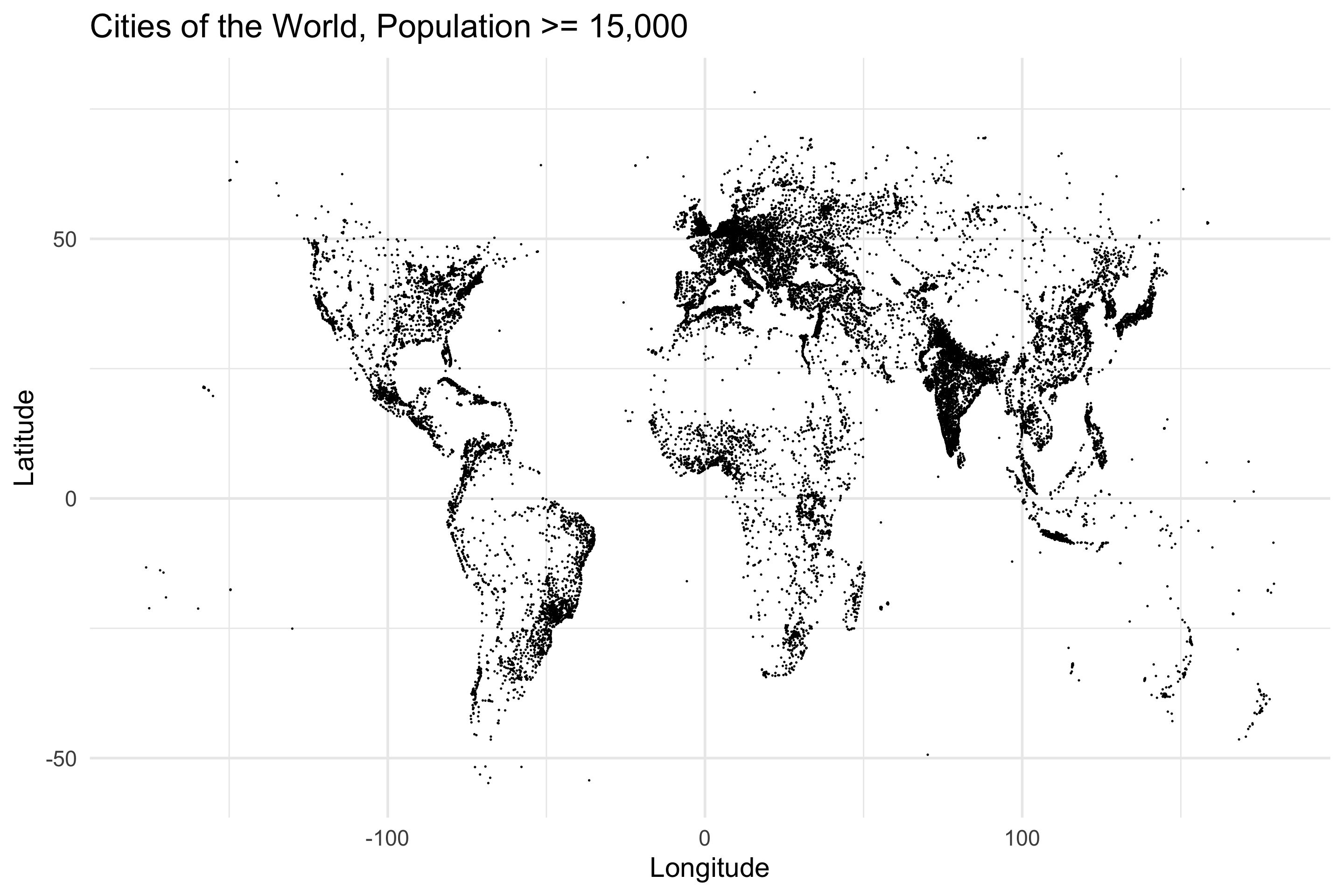
Lovely. Let’s get our data in order. We’ve got two dimensional points, and we’re going to randomly project them. Now this is weird. We’ve been talking about dimensionality reduction for the past post and a half, but this time we’re going to increase the dimensionality of our data using random projection. Don’t worry, I promise everything’s gonna be fine. Let’s get our projection on.
m = nrow(cities) #Number of points
N = 2            #Original Dimensionality
n = 32           #New Dimensionality

D = cities %>% select(Longitude, Latitude) %>% as.matrix()
R = matrix(rnorm(N * n, 0, 1), N, n) / sqrt(n)

projected = D %*% R
Everything is the same as before. We got the data in the data matrix, we sampled the random matrix, we multiplied. We’ve projected our 2 dimensional data up to 32 dimensions. Let’s take a look at one of these points in the projected space…
projected[1,]## [1] 2.3732255 -3.8206488 12.5139684 -1.6479450 -3.1994738 2.5399825
## [7] 1.4687836 8.5981372 1.7342170 2.7102246 11.4645631 -9.7409857
## [13] -6.9046257 6.8856829 -9.4760979 -3.9079113 8.4754133 0.5234313
## [19] -0.7932036 2.4083313 12.0226550 -2.3562125 2.1525340 4.1289898
## [25] 0.5624925 -11.5635252 -7.0471801 0.5223331 -1.8464111 1.4006863
## [31] 9.5732358 -10.4245337OK, so each row in the projected matrix has 32 numbers. The next step in the process is to turn each row of 32 numbers into 32 bits using their signs. Positive numbers will map to 1s and negative numbers will map to 0s.
projected_bits = matrix(as.numeric(projected >= 0), m, n) ##Compare with zero to get the sign of each number...
projected_bits[1,] ##And now we have 1s and 0s
## [1] 1 0 1 0 0 1 1 1 1 1 1 0 0 1 0 0 1 1 0 1 1 0 1 1 1 0 0 1 0 1 1 0Our projected data is now a collection of 32-bit strings, which I’m going to call hashes. Let’s visualize the data by coloring the points on the original map by their projected hashes.
cities_with_hashes = cities %>% bind_cols(Hash = apply(projected_bits, 1, paste0, collapse=""))
cities_with_hashes %>%
  ggplot(aes(Longitude, Latitude, color=Hash)) +
  geom_point(size = 0.5) +
  theme(legend.position = "none") +
  scale_color_manual(palette = jason_colors) +
  labs(title="Cities of the World, Population >= 15,000",
       subtitle="Colored by projected hash")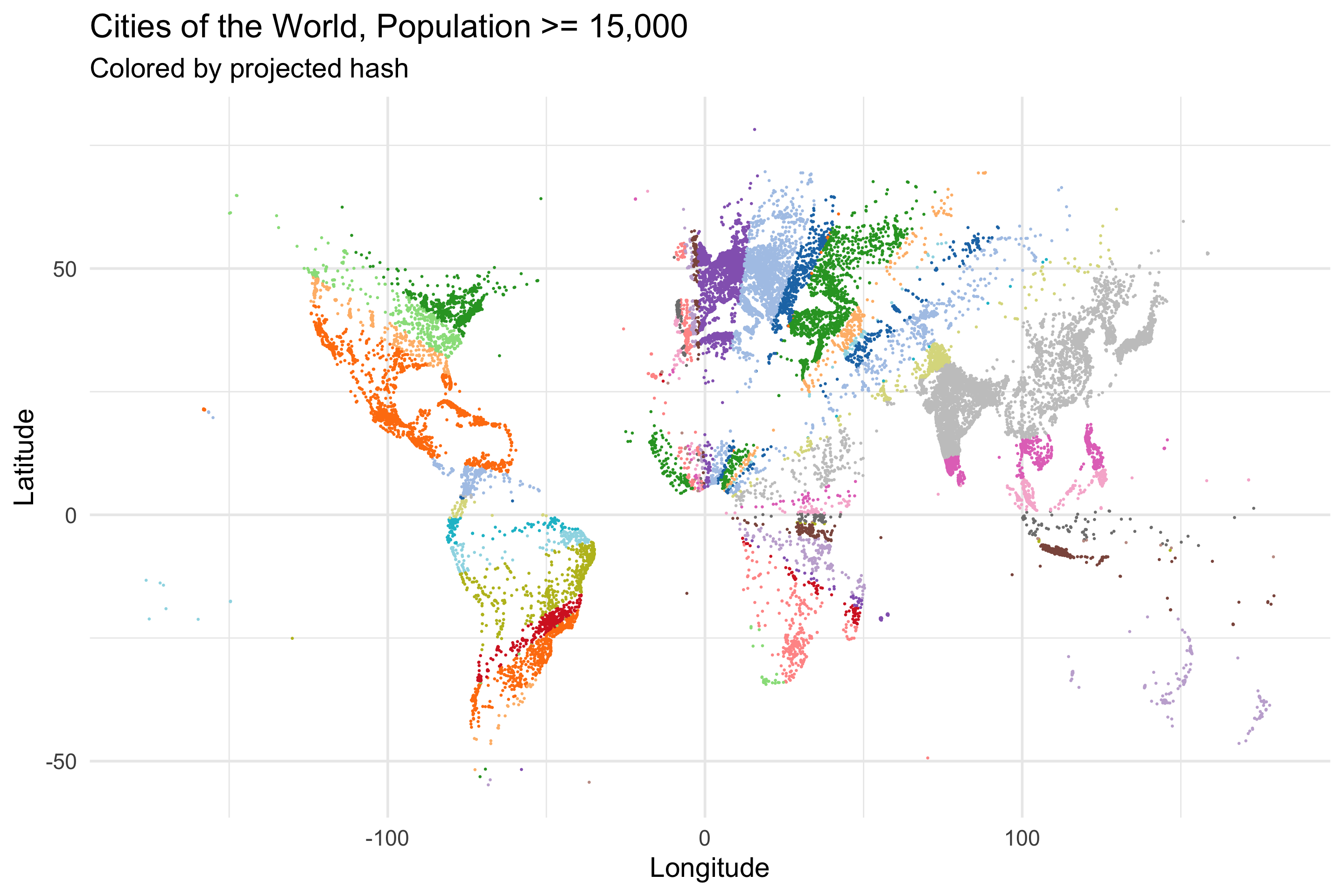
Well well well. It looks like there’s some radial symmetry going on. It’s a little hard to see though. Let’s fill in all the space to make it a bit more apparent…
all_space = crossing(Longitude = seq(-180, 180, .5),
                     Latitude = seq(-90, 90, .5)) %>%
  mutate(Id = row_number())
all_space_projected = all_space %>% select(Longitude, Latitude) %>% as.matrix() %*% R

all_space_projected_bits = all_space_projected >= 0
all_space_with_hashes = all_space %>% bind_cols(Hash = apply(matrix(as.numeric(all_space_projected_bits), nrow(all_space), n), 1, paste0, collapse=""))

all_space_with_hashes %>%
  ggplot(aes(Longitude, Latitude, color=Hash)) +
  geom_point(size = 0.5) +
  theme(legend.position = "none") +
  scale_color_manual(palette = jason_colors) +
  labs(title="Space of the World",
       subtitle="Colored by projected hash")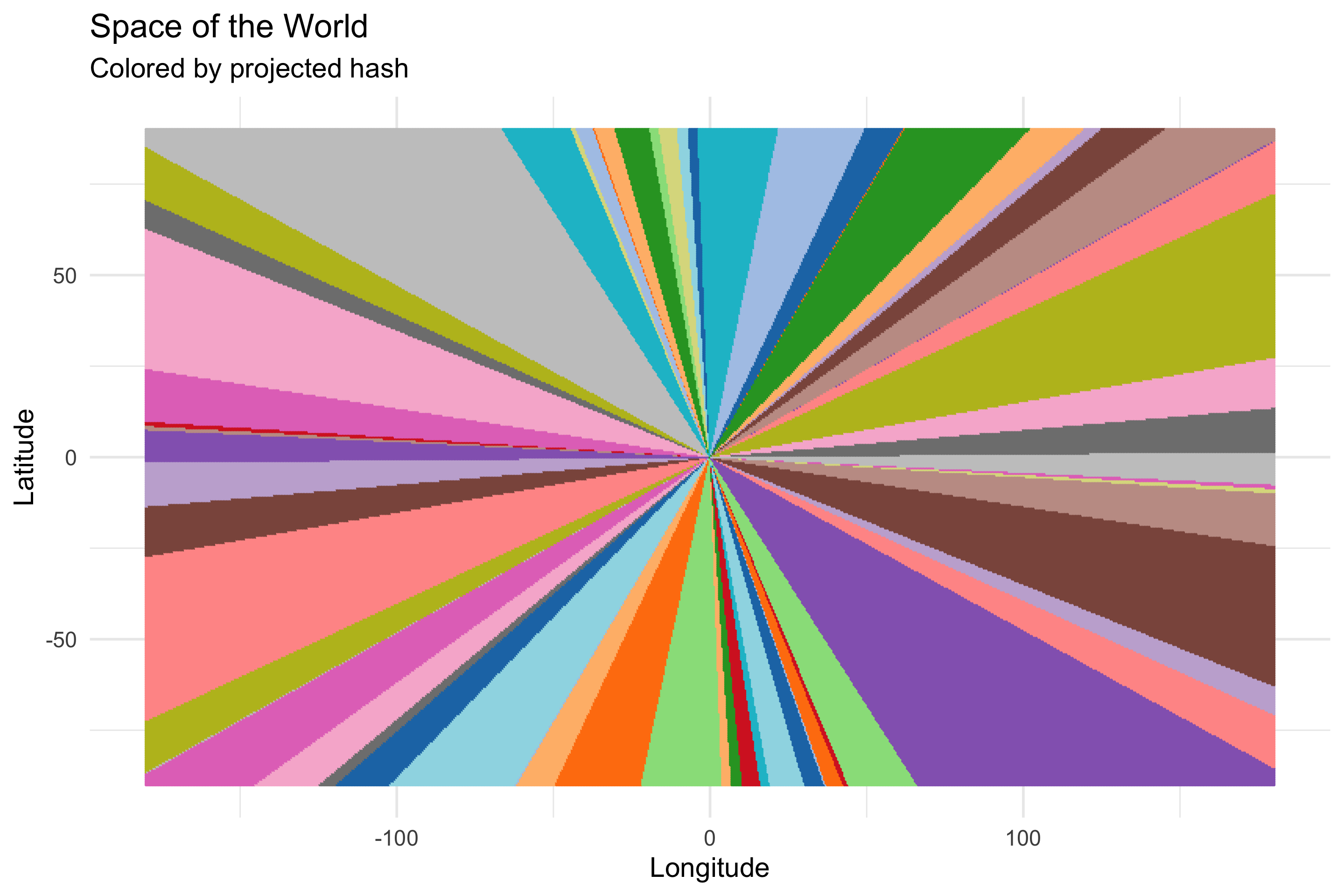
My my my. So our modified random projection scheme has organized 2d space into these spoke-like regions, and all the points in each spoke have the same hash (note: duplicate colored regions are false duplicates, the color palette we’re using is only so large). That’s rather surprising.
###Brace Yourself
What’s more surprising is that the spokes next to eachother have hashes that are closer to eachother than spokes that are farther away. What do we mean by close? We’ll use the Hamming distance, which is just a fancy way of saying “count the bits where two hashes differ”. To calculate the Hamming distance between two hashes we’ll sum the bits of the XOR of the two hashes.
new_york_index = all_space %>% filter(Longitude == -74, Latitude == 41) %>% .$Id
new_york_bits = all_space_projected_bits[new_york_index,]

distances = apply(all_space_projected_bits, 1, function(row) { sum(xor(new_york_bits, row)) })
We picked New York City as our reference point, and calculated the Hamming distance to all other points in the space…let’s plot.
all_space %>%
  bind_cols(HammingDistanceToNewYork = distances) %>%
  ggplot(aes(Longitude, Latitude, color=HammingDistanceToNewYork)) +
  geom_point() +
  scale_color_viridis() +
  geom_point(aes(x=-74, y=41), color="red") +
  annotate("text", -74, 50, label="New York City", color="red", size=7) +
  theme(legend.position = "none")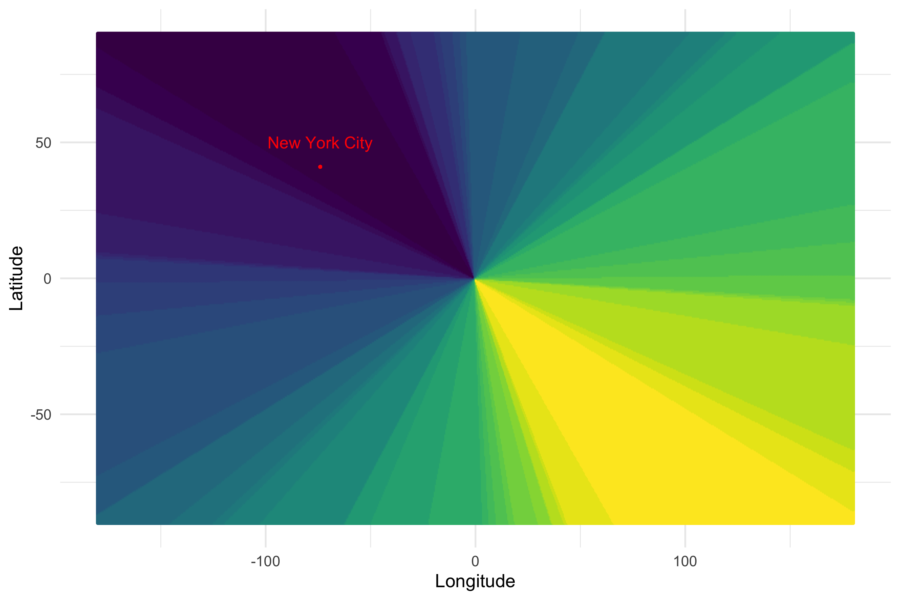
Holy moly. What’s going on here? Black means that point has a low hamming distance to New York, while yellow means that point has a high Hamming distance to New York. Our random projection method has transformed our original 2d coordinates into a locality sensitive hash. Points that are close to each other in real space, have hashes that are similar to each other in Hamming space. Let’s look at another city, Rio de Janeiro…
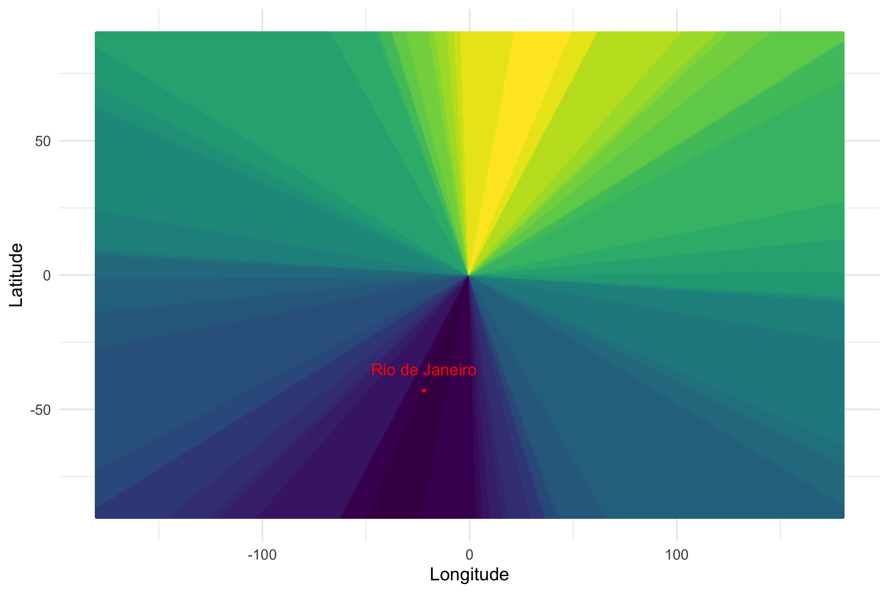
Still works. Pretty amazing.
Let’s fix it!
What do you mean, fix it!? It is, amazingly, not broken in the first place! Well, having space organized into spokes is nice and all, but that’s not really how we think of closeness as humans. Can we alter the method to change the shape of the regions so that the version of closeness the hashes see is more like the closeness that we think of as humans? The answer is yes.
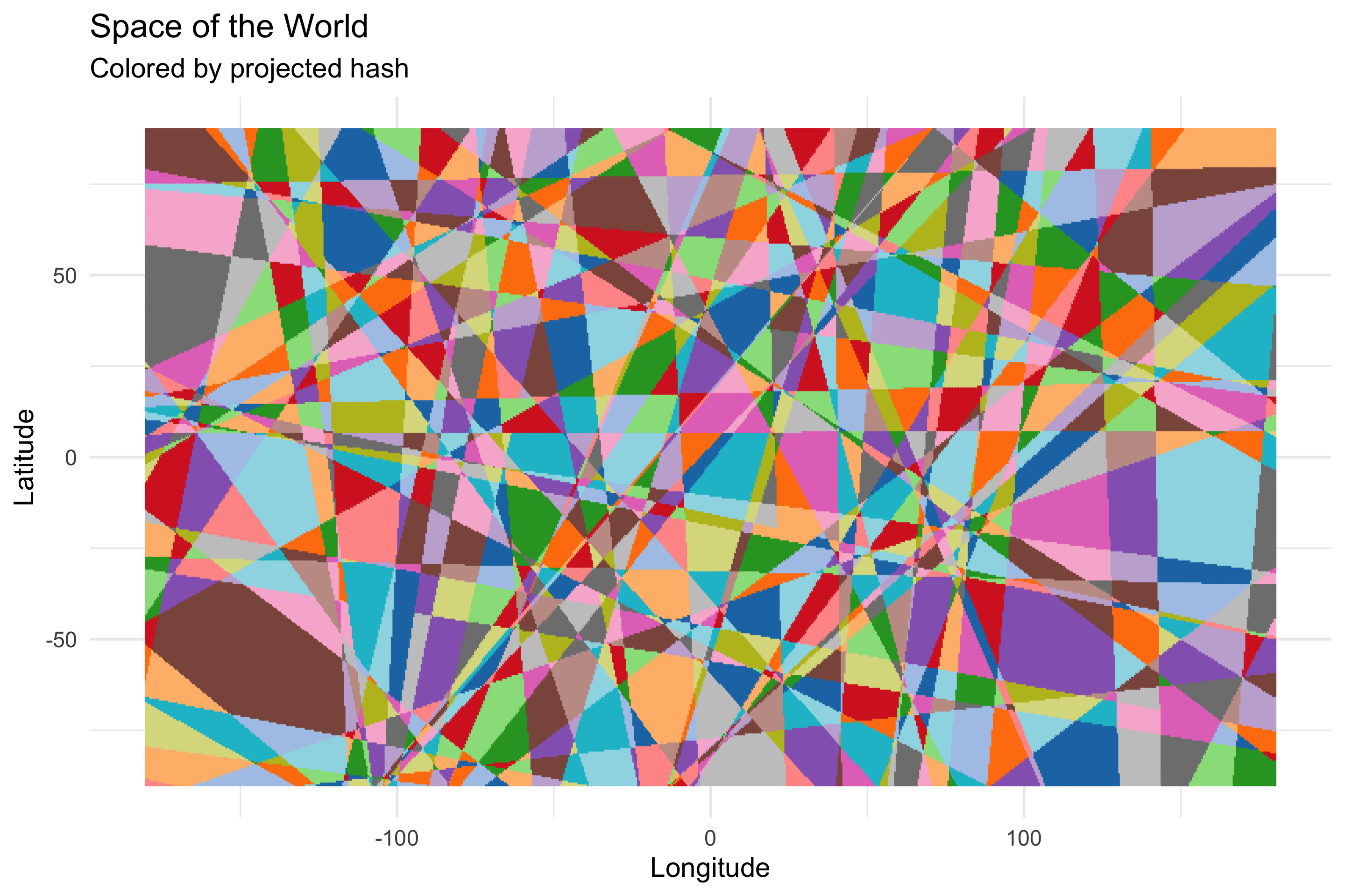
Now I don’t have any real theoretical motivation for what I did here, I just thought really hard and, luckily, I ended up where I wanted to be. The thing I observed is that all the spokes emanate from the origin because that’s the point by which all the other points in the space are defined. The Latitude of a point is defined in reference to the origin, which has Latitude 0. Likewise for the longitude. My thought was to extend the definition of each point in the space to be in reference to not just the origin, but another point as well. That means instead of running the random projection on just a 2d point, I need to come up with some more dimensions. So in addition to the original Latitude and Longitude of the points, I’m going to add Longitude+180, Longitude-180, Latitude+90, and Latitude-90. If we rerun the random projection and plot the hashes of each point…
N = 6
n = 32
R = matrix(rnorm(N * n, 0, 1), N, n) / sqrt(n)

all_space = crossing(Longitude = seq(-180, 180, .5),
                     Latitude = seq(-90, 90, .5)) %>%
  mutate(Id = row_number(),
         Lon2 = Longitude + 180, Lat2 = Latitude+90,
         Lon3 = Longitude - 180, Lat3 = Latitude-90)
all_space_projected = all_space %>% select(Longitude, Latitude, Lon2, Lat2, Lon3, Lat3) %>% as.matrix() %*% R

all_space_projected_bits = all_space_projected >= 0
all_space_with_hashes = all_space %>% bind_cols(Hash = apply(matrix(as.numeric(all_space_projected_bits), nrow(all_space), n), 1, paste0, collapse=""))

all_space_with_hashes %>%
  ggplot(aes(Longitude, Latitude, color=Hash)) +
  geom_point(size = 0.5) +
  theme(legend.position = "none") +
  scale_color_manual(palette = jason_colors) +
  labs(title="Space of the World",
       subtitle="Colored by projected hash")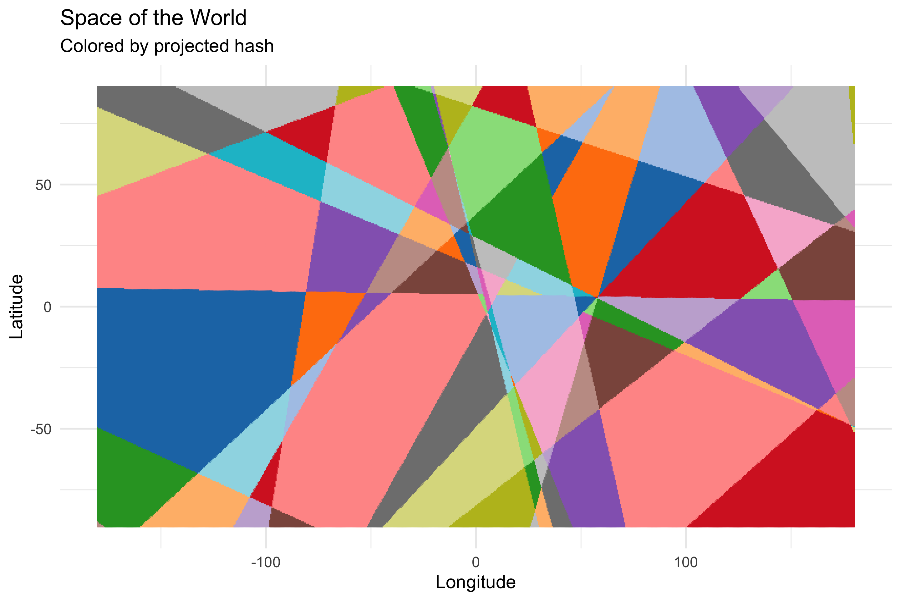
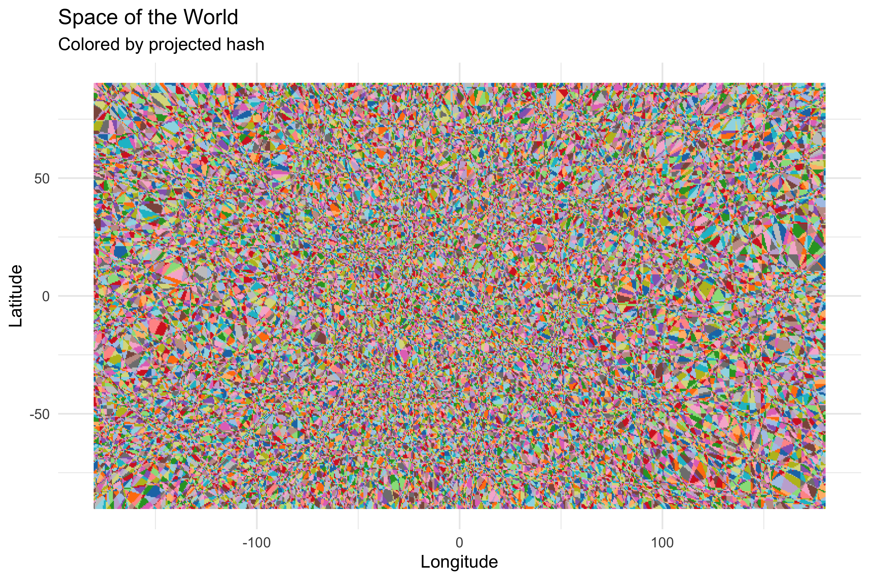
OK, so that’s kinda big and blocky. Let’s up the number of dimensions in the projected space from 32 to 128…
OK, a bit less blocky…1024?
Alright alright alright. Now we changed the method…did we lose the locality sensitivity? If we do the hamming-distance-to-new-york dance again…
new_york_index = all_space %>% filter(Longitude == -74, Latitude == 41) %>% .$Id
new_york_bits = all_space_projected_bits[new_york_index,]

distances = apply(all_space_projected_bits, 1, function(row) { sum(xor(new_york_bits, row)) })
bound = all_space %>%
  bind_cols(HammingDistanceToNewYork = distances)

bound %>%
  ggplot(aes(Longitude, Latitude, color=HammingDistanceToNewYork)) +
  geom_point() +
  scale_color_viridis() +
  geom_point(aes(x=-74, y=41), color="red") +
  annotate("text", -74, 50, label="New York City", color="red", size=7) +
  theme(legend.position = "none")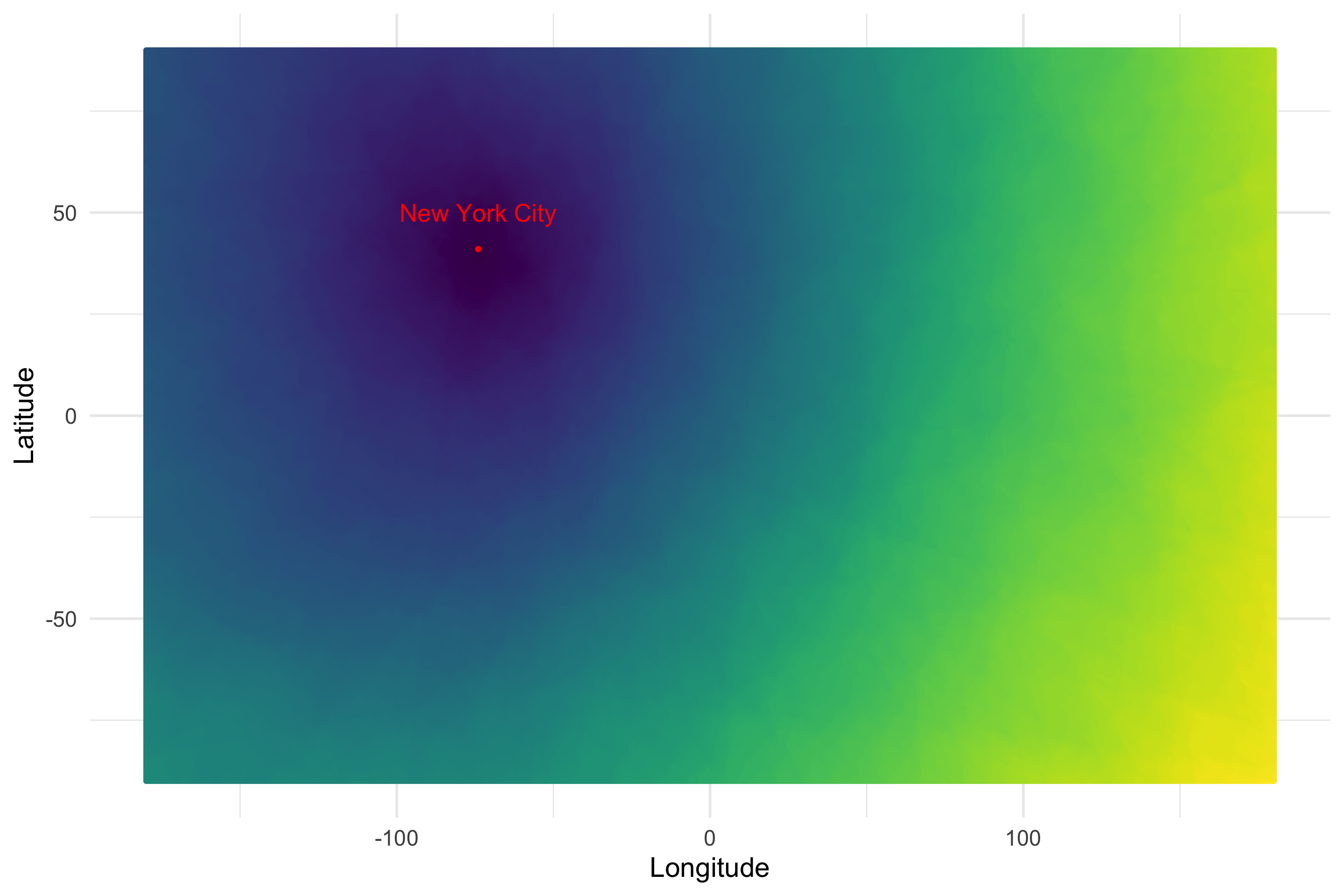
We find out that no, we haven’t. Dark points are closer to New York, brighter ones are farther away. I wanted to see what it would look like to walk New York’s nearest neighbors in order in the hash space so I made this video.
I remain flabbergasted by what you can do with random projection. That it works at all is surprising, and that my handwavey modifications didn’t break it is doubly so.
